Friday, June 2, 2023
Happy Friday. Hope you enjoy this newsletter.
Item 1: a link
Some weeks I spend a lot of time thinking about the link I share here - worrying about doing justice to a complicated tapestry of reporting and putting it in its proper context, plus providing my own perspective and, ideally insight.
Other weeks I just put a hyperlink on the words Norwegian hot dogs and call it a day.
Item 2: a list
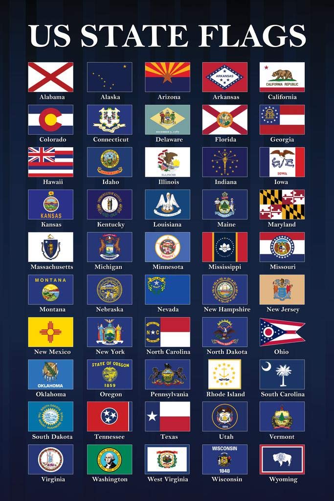
US state flags plus DC, an annotated ranking:
- New Mexico (they nailed it, folks)
- District of Columbia (simple and iconic)
- Arizona (bold color choices and simple geometric excellence)
- Texas (I’m not happy about it either but when your state flag is both an excellent abstraction of your national flag and it’s the flag you used when you were an independent nation, it’s a damn good flag)
- Alaska (class act all the way)
- Oregon (Alaska’s fun cousin and the only flag with a different design on the back)
- Utah (old state flag: overstuffed but the beehive is great. New state flag: wisely doubling down on that great beehive!)
- Colorado (a little weird, which is a good thing)
- Indiana (this flag symbolizes liberty and enlightenment and pays a respectful tribute to the 13 original colonies, and looks good)
- South Carolina (shocked that this is, by far, the best Carolina flag)
- Maine (somehow this flag is so bad it swings back around to good. And it has a moose on it.)
- Louisiana (this flag is kinda metal)
- Ohio (big points for the swallowtail shape, but the geometric design is a little unbalanced for me and I think states should think outside the red white & blue box)
- Oklahoma (I’m digging the blue-on-lighter-blue concept)
- Minnesota (cute!)
- California (not inspired design-wise but the concept has potential)
- Vermont (could be a lot better but it has a nice tree on it)
- Montana (big points for putting the state motto in Spanish)
- New York (too busy but I like the eagle atop the globe and “Excelsior” is an excellent state motto)
- Connecticut (most of these original colonies are stuck with some boring/busy designs)
- Mississippi (inspiring demonstration that all these states can just up and stop having flags paying homage to the Confederacy)
- Rhode Island (a lot of negative space but I like the simple logo and motto)
- Georgia (pretty derivative of the Stars & Bars, but worse)
- Idaho (this is like one of those old school original colonies flags, except Idaho had a long time to come up with something better and didn’t)
- Hawaii (the Union Jack does not belong on an American flag - also, just a huge missed opportunity for any number of better design options)
- Illinois (reminds me of Delaware but putting the state name on the flag is marginally better than putting a date on the flag)
- Iowa (Illinois, but make it look a little French)
- Virginia (we stan a feminist depiction of the goddess Virtus subduing a tyrant, and “sic semper tyrannus” was one of the most badass state mottos imaginable until John Wilkes Booth reappropriated it, but now it does remind us of John Wilkes Booth so that’s tough)
- Tennessee (I’m a little confused by this one but it does look pretty good. Just hope it isn’t secretly pro-Confederacy.)
- Nevada (why is 80% of the flag just blue and all the actual decent design is stuffed into a corner?)
- New Hampshire (best execution of Original Colony Chic)
- South Dakota (crushes North Dakota but not very good)
- Nebraska (inoffensive but too wordy and it includes a train meant to indicate people fleeing the state for the Rocky Mountains)
- Massachusetts (no state name, which is good, but otherwise it’s bad and arguably exploitative of Native Americans. But they’re working on it.)
- Missouri (overall it’s pretty good and I like the use of bears, but I have some concerns about the white strip representing “purity”)
- Pennsylvania (horsies)
- West Virginia (white background seems like a mistake, but the rhododendron wreath is pleasant)
- New Jersey (the state seal looks bad but it’s a pretty anodyne tribute to the American Revolution - and grain)
- Wisconsin (they should just replace this with a giant picture of Bucky Badger)
- Kansas (again with the state name on the flag? Just make the little seal in the middle the whole flag imo)
- Delaware (putting a date on the bottom of a flag is a choice (a bad choice))
- Michigan (way too busy and far too much Latin, but I do like “circumspice”)
- Wyoming (kinda cool from a simple design perspective but I feel a little icky about the red border symbolizing Native Americans)
- North Dakota (New Jersey-level design but worse)
- Kentucky (mediocre!)
- Washington (some very odd decisions were made here)
- North Carolina (North Carolina, what are you doing???)
- Maryland (distinctive in all the worst ways, including building it around the explicit depiction of Maryland as a state that had a bunch of Confederate sympathizers running around)
- Florida (ugly and weird with a design element that seems like it’s probably a horrifying tribute to the Confederacy)
- Alabama (horrifying tribute to the Confederacy)
- Arkansas (horrifying tribute to the diamond industry and also the Confederacy)
Item 3: a media recommendation
Item 4: word of the week
Aureate
It probably says something about how little thought we put into the English language that "purple prose" is a synonym for aureate diction.
Item 5: a photograph

See ya!
Thanks for reading. I am off to Yosemite National Park for a long weekend of not looking at my telephone quite so often. So I'll see you next week.
Member discussion